Test Chambers: Difference between revisions
Small section added to the designs |
→Test Chamber Design/styles: Added images |
||
| Line 9: | Line 9: | ||
== Test Chamber Design/styles == | == Test Chamber Design/styles == | ||
[[Image:Portal1old.jpg|thumb|The '''clinical''' look]] | |||
[[Image:Portal1Old.jpeg|thumb|Example of the '''remastered clinical''' look]] | |||
[[Image:P2ruins.jpg|thumb|The '''decayed clinical/the ruins''' look]] | |||
[[Image:TheCJohnsonLevels.png|thumb|Exaple of the '''60s era''' look]] | |||
* '''"Clinical" look/style ([[Portal]])''' | * '''"Clinical" look/style ([[Portal]])''' | ||
Every [[Portal]] chamber (not including the escape sequence) has a distinct and recognizable look - white, sterile rooms with the atmosphere that conveys the emotions of loneliness. Most of the objects look a little bit blurry and maybe that's done on purpose because is makes the items look more dusty and immerse the player better into the Portal experience. | Every [[Portal]] chamber (not including the escape sequence) has a distinct and recognizable look - white, sterile rooms with the atmosphere that conveys the emotions of loneliness. Most of the objects look a little bit blurry and maybe that's done on purpose because is makes the items look more dusty and immerse the player better into the Portal experience. | ||
* '''"The remastered clinical" look/style ([[Portal 2]])''' | * '''"The remastered clinical" look/style ([[Portal 2]])''' | ||
One part of the [[Portal 2]] chambers looks like the chambers from [[Portal]] but made to fit the theme of the game and looking more fresh and modern compared to the looks of the first game in the series. The panels are more reflective, polished and easily recognizable to the average player. Every item design is revamped to stick to the modernistic theme this game has to offer, and it's a welcome addition! | One part of the [[Portal 2]] chambers looks like the chambers from [[Portal]] but made to fit the theme of the game and looking more fresh and modern compared to the looks of the first game in the series. The panels are more reflective, polished and easily recognizable to the average player. Every item design is revamped to stick to the modernistic theme this game has to offer, and it's a welcome addition! | ||
* '''"The decayed clinical" look/style ([[Portal 2]])''' | |||
* '''"The decayed clinical/The ruins" look/style ([[Portal 2]])''' | |||
This type of level design can be seen mostly in the first few chapters of [[Portal 2]] where you'll explored the devastating designs of destroyed levels. Outgrown leaves and grass dominate over the ruined panels mostly missing ''the final touch'', just having the metal holder rim visible on the surface. These levels may be looking hard to navigate but it actually isn't. The ruins don't seem a big roadblock to the player, but they make the player seem nostalgic and maybe sad, because {{Spoiler|the destroyed parts are the players' fault, and}} they might find themselves guilty, even though they shouldn't be. | This type of level design can be seen mostly in the first few chapters of [[Portal 2]] where you'll explored the devastating designs of destroyed levels. Outgrown leaves and grass dominate over the ruined panels mostly missing ''the final touch'', just having the metal holder rim visible on the surface. These levels may be looking hard to navigate but it actually isn't. The ruins don't seem a big roadblock to the player, but they make the player seem nostalgic and maybe sad, because {{Spoiler|the destroyed parts are the players' fault, and}} they might find themselves guilty, even though they shouldn't be. | ||
* '''"The 60's era" look/style ([[Portal 2]])''' | * '''"The 60's era" look/style ([[Portal 2]])''' | ||
Trough the [[Portal 2]] storyline you will encounter very old looking levels with graphics pre-dating the 90's. They are, so called, ''the Cave Johnson levels'' and they have a distinct look no other level has. Its color use shifts more to the hues of green, yellow, brown etc., which is quite different to the color scheme all of the other [[Portal]] levels have - the hues of black and white. The contents of the test chambers' designs are more colorful and noticeable. Almost everything doesn't cut corners, other than the decorative pipes. | Trough the [[Portal 2]] storyline you will encounter very old looking levels with graphics pre-dating the 90's. They are, so called, ''the Cave Johnson levels'' and they have a distinct look no other level has. Its color use shifts more to the hues of green, yellow, brown etc., which is quite different to the color scheme all of the other [[Portal]] levels have - the hues of black and white. The contents of the test chambers' designs are more colorful and noticeable. Almost everything doesn't cut corners, other than the decorative pipes. | ||
Revision as of 18:56, 31 March 2022
Test Chambers are a vital part of the Portal series and the Aperture Science Enrichment Center. Via the Security Cameras fixed onto the walls of test chambers at various points, GLaDOS can track a test subject's movements and progress.
There are hundreds and more test chambers throughout the Enrichment Center, which can be easily reconfigured and recycled to form another new test chamber. In Portal 2, these chambers can be swiftly created by GLaDOS with the usage of robotic arms carrying panels and combining them with other panels to form a ceiling, floor, and walls.
Aesthetically, these chambers bear resemblance to a hospital with its sterile environment; due to the lighting used within chambers, and the black and white coloring of the walls, floors, and ceilings.
Test Chamber Design/styles
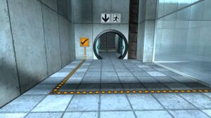
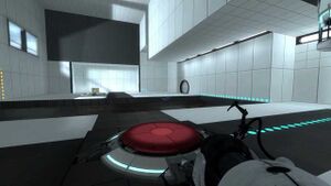
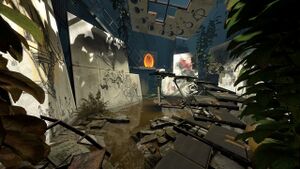
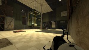
- "Clinical" look/style (Portal)
Every Portal chamber (not including the escape sequence) has a distinct and recognizable look - white, sterile rooms with the atmosphere that conveys the emotions of loneliness. Most of the objects look a little bit blurry and maybe that's done on purpose because is makes the items look more dusty and immerse the player better into the Portal experience.
- "The remastered clinical" look/style (Portal 2)
One part of the Portal 2 chambers looks like the chambers from Portal but made to fit the theme of the game and looking more fresh and modern compared to the looks of the first game in the series. The panels are more reflective, polished and easily recognizable to the average player. Every item design is revamped to stick to the modernistic theme this game has to offer, and it's a welcome addition!
- "The decayed clinical/The ruins" look/style (Portal 2)
This type of level design can be seen mostly in the first few chapters of Portal 2 where you'll explored the devastating designs of destroyed levels. Outgrown leaves and grass dominate over the ruined panels mostly missing the final touch, just having the metal holder rim visible on the surface. These levels may be looking hard to navigate but it actually isn't. The ruins don't seem a big roadblock to the player, but they make the player seem nostalgic and maybe sad, because the destroyed parts are the players' fault, and they might find themselves guilty, even though they shouldn't be.
- "The 60's era" look/style (Portal 2)
Trough the Portal 2 storyline you will encounter very old looking levels with graphics pre-dating the 90's. They are, so called, the Cave Johnson levels and they have a distinct look no other level has. Its color use shifts more to the hues of green, yellow, brown etc., which is quite different to the color scheme all of the other Portal levels have - the hues of black and white. The contents of the test chambers' designs are more colorful and noticeable. Almost everything doesn't cut corners, other than the decorative pipes.
Challenge modes
In Portal, challenge mode test chambers can be found in the game's "Bonus Maps" menu option. In Portal 2 however, the challenge modes can be played via selecting "Play Challenge Mode" in either single-player or co-op.
The chambers in the challenge mode are identical to the original campaign versions, only with the implementation of goal-based puzzles. These include completing the map with the:
- Least amount of portals deployed
- Least time elapsed
- Least amount of steps taken (Available in Portal only)
In Portal, the stats will be compared to the goal, and if you matched the number of portals / steps / time to the goal (or got less than it), it will get harder and harder. In Portal 2, player stats will be saved into the Steam leaderboards. This allows the Steam community to keep track of friends and other players who have beaten them in either least portals created, or least time taken to complete a test chamber.
Advanced chambers
Available only in Portal, these are variants of the test chambers which have been redesigned with an advanced difficulty curve, for instance by decreasing the number of portalable surfaces, or by increasing the presence of Goo.
Like challenge chambers in Portal, advanced chambers can be played via the "Bonus Maps" section on the main menu.
The Portal 2 Sixense MotionPack DLC contains advanced chambers for Portal 2.
Related achievements
Portal
Test chamber mechanics
Portal
- Portals - The core mechanic of the game, the "worm holes" used to complete the test chambers. Introduced in the Relaxation Vault.
- Heavy Duty Super-Colliding Super Button - Can be pressed by the player or held with a cube, the button acts like a switch, turning on and off different things (opening doors for instance). Introduced in Test Chamber 00.
- Vital Apparatus Vent - The air vent delivering the cubes into the chambers. Introduced in Test Chamber 00.
- Cubes - A multipurpose object used to press buttons, block unwanted forces, or to stand upon. (Weighted Storage Cube introduced in Test Chamber 00 & Weighted Companion a special cube introduced in Test Chamber 17)
- Material Emancipation Grill - A grid put at the end of test chambers used to stop players from getting objects out of the chamber. It is also used as a test element. Introduced in Test Chamber 00
- Victory Lift - A vertical variant of the Unstationary Scaffold that automatically rises if a player is upon it, and descends if unoccupied. Introduced in Test Chamber 06.
- High Energy Pellet - An energy ball that needs to be put in its receptacle to power other objects. Introduced in Test Chamber 06.
- Unstationary Scaffold - A platform used for transportation along a rail. Introduced in Test Chamber 07.
- Turrets - Military grade turrets used for area denial. They fire bullets at players that enter their field of view. Introduced in Test Chamber 16.
Portal 2
- Aerial Faith Plate - A launcher that throws the player and any objects at a fixed trajectory. Introduced in Chapter 2 Test Chamber 5.
- Thermal Discouragement Beam - A laser beam fired in a straight line. Must be avoided or redirected using a Discouragement Redirection cube. Introduced in Chapter 2 Test Chamber 1.
- Cubes (Edgeless Safety & Discouragement Redirection) - Cubes that can be used to hold down buttons for example (Discouragement Redirection introduced in Chapter 2 Test Chamber 2 and Edgeless Safety introduced in Co-op Course 1 Chamber 2).
- Hard Light Bridge - A semi-translucent, solid 'sheet' of light that can act as a bridge or wall. Introduced in Chapter 3 Test Chamber 11.
- Gels (Propulsion, Repulsion & Conversion) - Can coat surfaces and apply different effects. Repulsion introduced in Chapter 6 Enrichment Sphere 2, Propulsion Chapter 7 Enrichment Sphere 5, Conversion Chapter 7 Enrichment Sphere 6.
- Excursion Funnel - While inside this funnel of energy, objects will be unaffected by gravity and will travel along the path of the funnel. Introduced in Chapter 8 Test Chamber 1.
- Edgeless Safety Cube Receptacle - Place Edgeless Safety Cubes into these receptacles to activate different types of objects. Introduced in Co-op Course 1 Chamber 2.
List of test chambers
Official Games
Portal test chambers
Portal 2 test chambers
Portal: Still Alive test chambers
Mods
Portal Stories: Mel test chambers
| |||||||||||||||||||||||||||||||||||||||||||||||||||||||||||||||||||||||||||||||||||
| |||||||||||||||||||||||||||||||||||||||||||||||||||||||||||||||||||||||||||||||||||||||


